ShopDreamUp AI ArtDreamUp

Deviation Actions


Suggested Deviants


Suggested Collections


You Might Like…


Featured in Groups


Comments10
Join the community to add your comment. Already a deviant? Log In
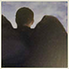
You have a really strong sense of lighting and how it affects contours. There is a definite light source here, we can tell what kind of lighting it is, and the shape of your character's face is is fairly well defined by your shading--his lips have form, so does his chin and the sockets of his eyes, the musculature of the neck. Good job with that. The anatomy isn't perfect (I'm looking at the placement of his ear) but it's clearly something you've worked on and is moving in a positive direction. I think you may be relying a little too heavily on your linework though. His nose looks flat compared to the rest of his face, because it isn't as rendered, and the flat black nostrils are a little jarring. Keep up with that shading, make it consistent through the image and I think that'll make it that much better. Don't be afraid to vary the black of his clothing, either.
I think you could improve your work with textures. Looking at other images of this character, he has an awesome cut and you love to draw it, but this is where your lighting starts to become inconsistent with the rest of the image. You have good detail in the curve where it comes up from his scalp with those little strays, but the lighting just feels a little too soft and smeary to look and feel like hair. Likewise his feathers don't feel like feathers--the really heavy linework here makes them feel almost more like scales than feathers. Maybe tone back on that and see what you can do with color and texture alone, you might just come up with something softer and more feathery. You may also find them less intimidating to shade that way, too, because you're dealing with the wing as a shape rather than a lot of little individual spaces. Keep it up, keep pushing!